Vintage Wheels
Vintage Wheels
A personal exploration into editorial design, creating a visually engaging magazine layout that balances typography, imagery, and storytelling for an immersive reading experience.
A personal exploration into editorial design, creating a visually engaging magazine layout that balances typography, imagery, and storytelling for an immersive reading experience.
Client
Personal Project
Personal Project
Industry
Editorial Design
Editorial Design
Service
Typography, Layout Design, Visual Storytelling
Typography, Layout Design, Visual Storytelling
Duration
1 week
1 week
OVERVIEW
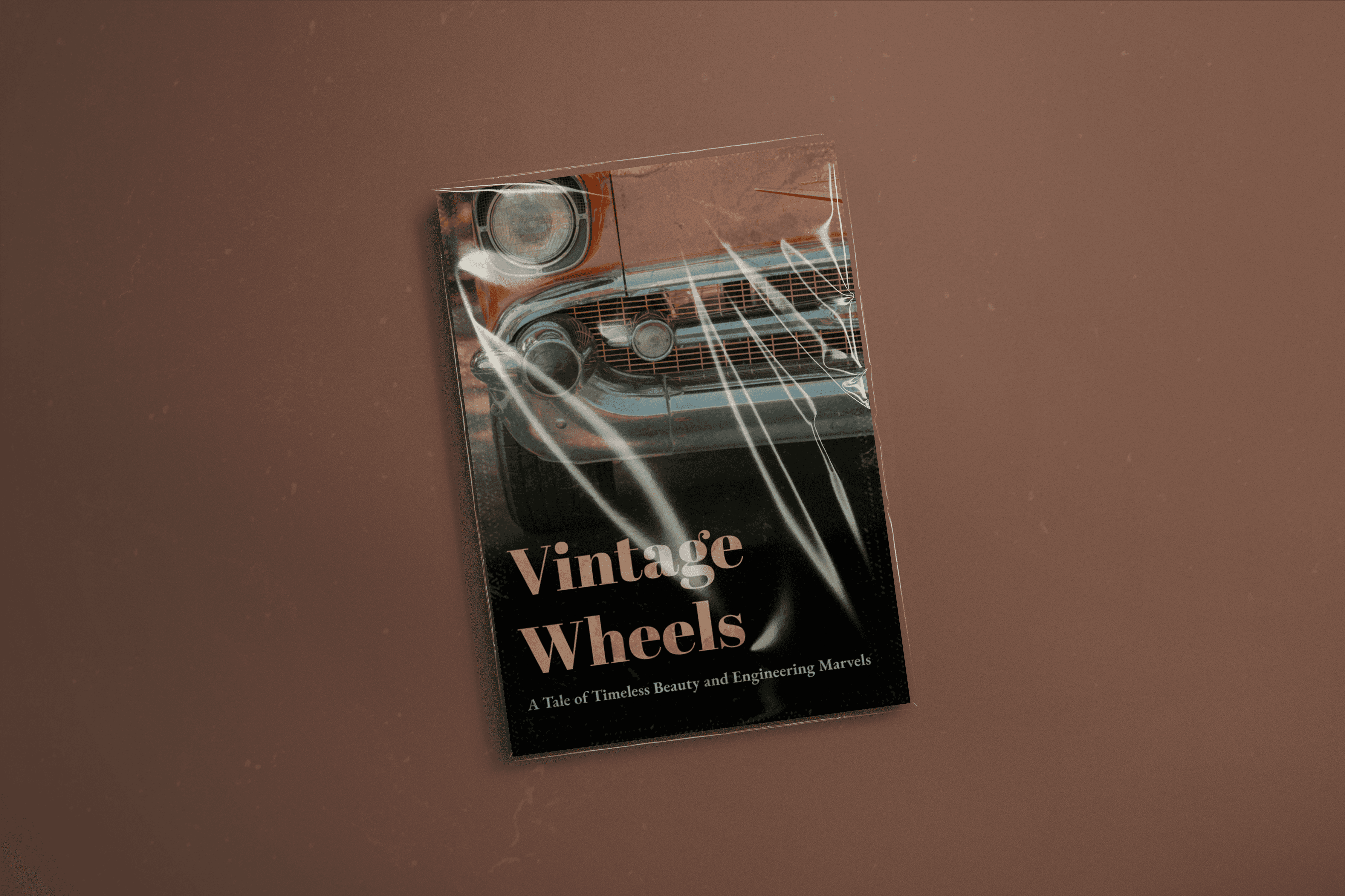
I set out to design a magazine spread celebrating the evolution of vintage cars, focusing on elevating typography and layout. Using a structured three-grid system, I created a balanced composition that blends bold headlines, elegant serifs, and nostalgic imagery for an authentic editorial feel.
I set out to design a magazine spread celebrating the evolution of vintage cars, focusing on elevating typography and layout. Using a structured three-grid system, I created a balanced composition that blends bold headlines, elegant serifs, and nostalgic imagery for an authentic editorial feel.
THE CHALLENGE
I needed to merge vintage charm with contemporary design, ensuring the layout was visually engaging while maintaining clarity and organization. Balancing bold typography, intricate details, and cohesive color schemes within a consistent grid posed the key creative challenge for this project.
I needed to merge vintage charm with contemporary design, ensuring the layout was visually engaging while maintaining clarity and organization. Balancing bold typography, intricate details, and cohesive color schemes within a consistent grid posed the key creative challenge for this project.
THE SOLUTION
I curated a moodboard inspired by vintage magazines, then built minimalist layouts using Abril Fatface and EB Garamond for strong yet elegant typography. A soft beige background with a damask texture and sepia-toned images completed a nostalgic yet fresh look true to the theme.
I curated a moodboard inspired by vintage magazines, then built minimalist layouts using Abril Fatface and EB Garamond for strong yet elegant typography. A soft beige background with a damask texture and sepia-toned images completed a nostalgic yet fresh look true to the theme.
THE RESULT
The final magazine design achieved a timeless, cohesive aesthetic praised for its clear hierarchy and balanced composition. The project strengthened my skills in typography, grid systems, and layout design while showcasing my ability to create striking editorial visuals with refined details.
The final magazine design achieved a timeless, cohesive aesthetic praised for its clear hierarchy and balanced composition. The project strengthened my skills in typography, grid systems, and layout design while showcasing my ability to create striking editorial visuals with refined details.


Conclusion
This project deepened my typography and layout expertise, taught me the nuances of creating visually engaging editorial designs, and refined my ability to craft consistent, impactful spreads—skills I’m excited to apply to future UI/UX and visual design projects.
This project deepened my typography and layout expertise, taught me the nuances of creating visually engaging editorial designs, and refined my ability to craft consistent, impactful spreads—skills I’m excited to apply to future UI/UX and visual design projects.
For more detailed process and work visit: Magazine Design